A reading tracker that shows who you are as a reader.
Booksona · PRODUCT DESIGN · BRAND · DESIGN SYSTEM · MOTION · FULL STACK
Status: Work in progress. Beta with invited readers.
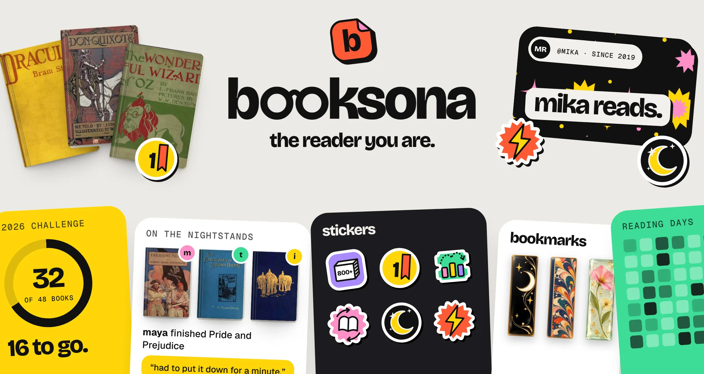
Booksona is a calm place to track your books and show who you are as a reader.
I came up with it, designed it and built it on my own: the product, the brand, the design system and the full stack behind it.
Properties
- Role
- Founder, product designer and design engineer
- Team
- Solo
- Timeline
- 2026, ongoing
- Platform
- Web, phone and desktop
- Status
- Beta with invited readers
- Tools
- Figma, Next.js, Supabase, AI coding agents
If you read nothing else
- The problem: Reading trackers count your books and stop there. Every profile looks the same, with nothing to say about you beyond your book history.
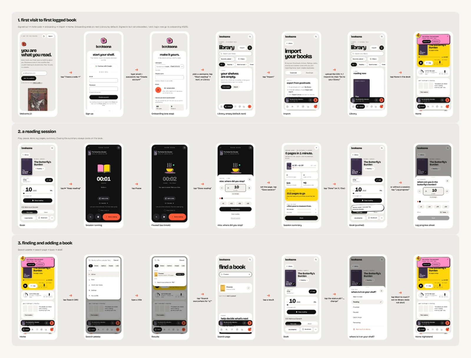
- What I did: Took Booksona from an idea to a live product by myself: positioning, brand, a token-based design system, a 70-screen journey map, motion, illustration, and the app itself.
- Where it is: Live in beta, with over 30 users as of Nov 15, 2026. One design system runs from Figma to production, and 4,800+ automated tests run on every change.
01, Why I built it
I noticed that people in my community struggle to read books and keep track of them. There are different ways to track your reading, most notably Goodreads, but its UI/UX is extremely outdated. It’s frustrating to use, ugly to look at, and it’s Big Corpo.
Tracking just felt like homework. Logging pages in any of these apps didn’t feel good, I felt no sense of accomplishment, and I was forcing myself to read. Streaks only turned me away: if I was too busy to read, I lost everything, and I didn’t want to go through the hassle of getting it back.
So I decided to build Booksona, and it had two jobs: make tracking a book quick and pressure-free, and offer lots of rewards and customization, because as the gamer saying goes, skins = wins.
You are what you read. Booksona helps you say that, not grade you on it.
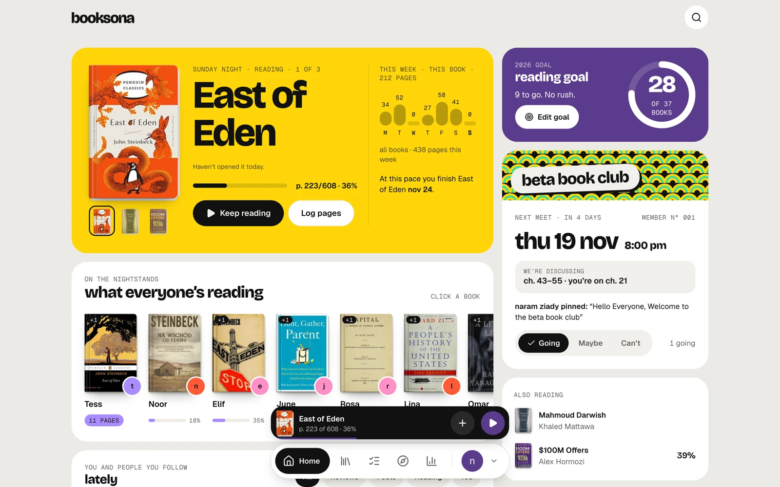
That became five rules I used to settle every design argument, in priority order:
- Calm canvas, loud moments., Screens stay quiet so the things that matter can be loud.
- Colour has a job., A bright colour is the reader’s own, a book, or the brand. Never decoration.
- Yours, within guardrails., Readers change almost everything, from choices I picked, so no profile can turn unreadable.
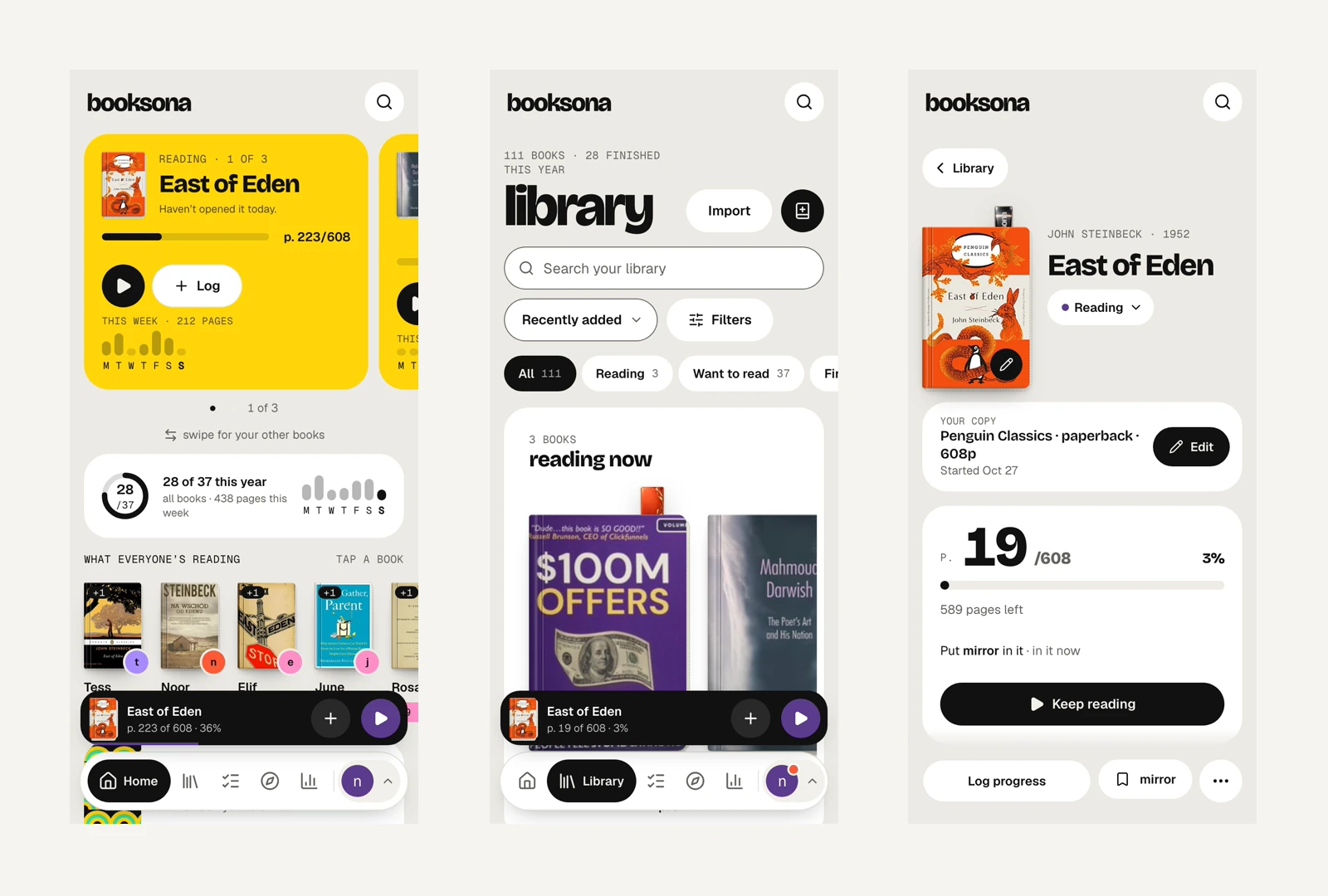
- Fast beats fancy., Logging pages takes one or two taps.
- Celebrate, never guilt., No streaks. Nothing you earn is taken away.
- Product strategy
- Positioning
- Design principles
02, The brand
I asked myself what name says books and also represents a person. Booksona instantly came to mind, funnily enough because a couple of weeks earlier I had talked to someone about their fursona.
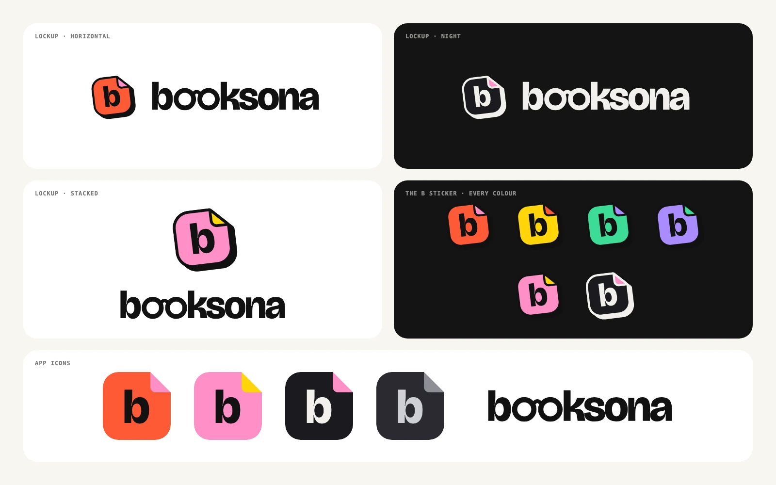
- The wordmark, The two o’s in “booksona” are a pair of reading glasses. It is a book app that looks back at you.
- The mark, A page with its corner folded down, the thing readers do to keep their place.
- The line, “the reader you are.” It is about who you already are, not who you should become.
- The voice, Calm, short and lowercase, with no exclamation marks. A quiet week reads “No reading. That’s allowed.”
- Brand identity
- UX writing
- Content design
03, The design system
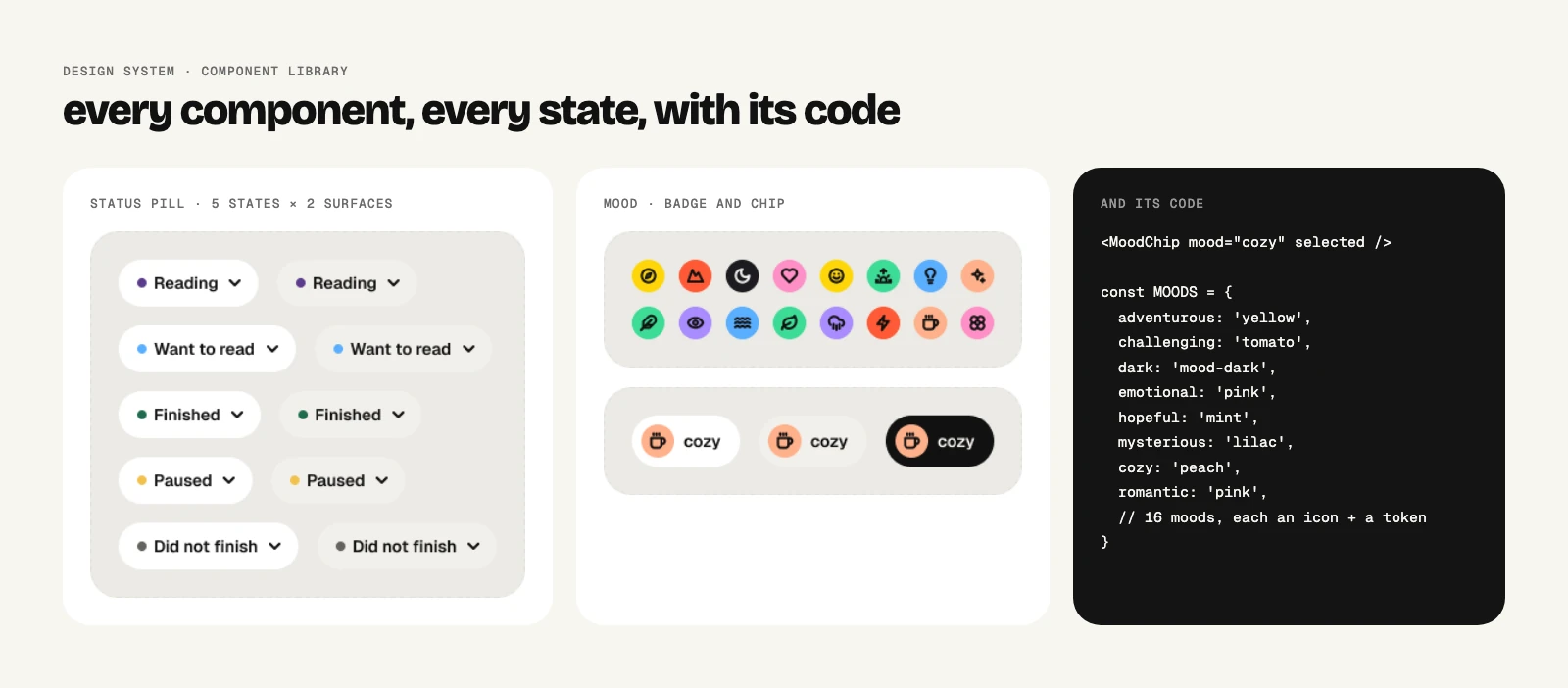
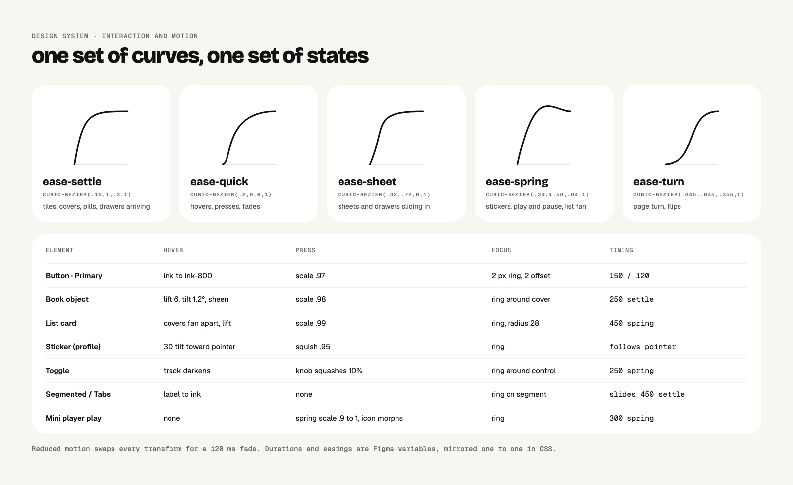
As a systems product designer, this is always on my list. I like working in a structured way: I create the components, they all live in one place, and building the app becomes a matter of dragging and dropping things into place.
- Design systems
- Visual design
- Accessibility
04, A profile that looks like you
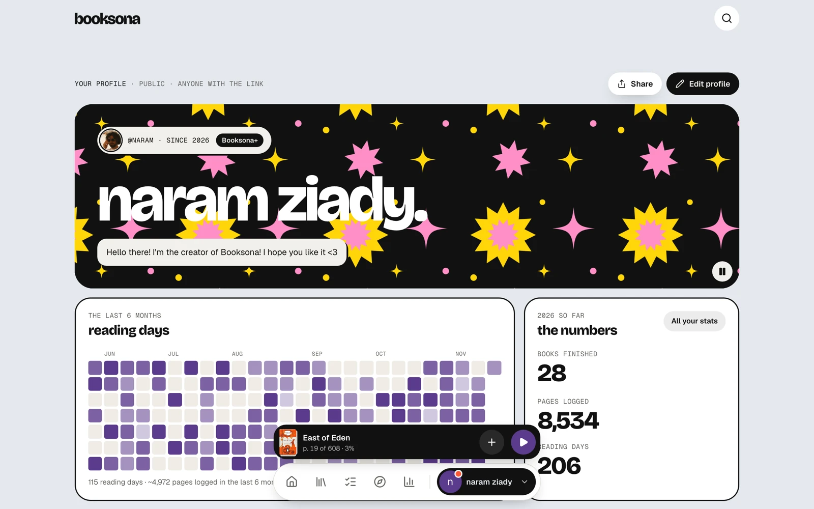
The profile is the showpiece, and the hardest design problem in the product: give readers real freedom without letting any profile break.
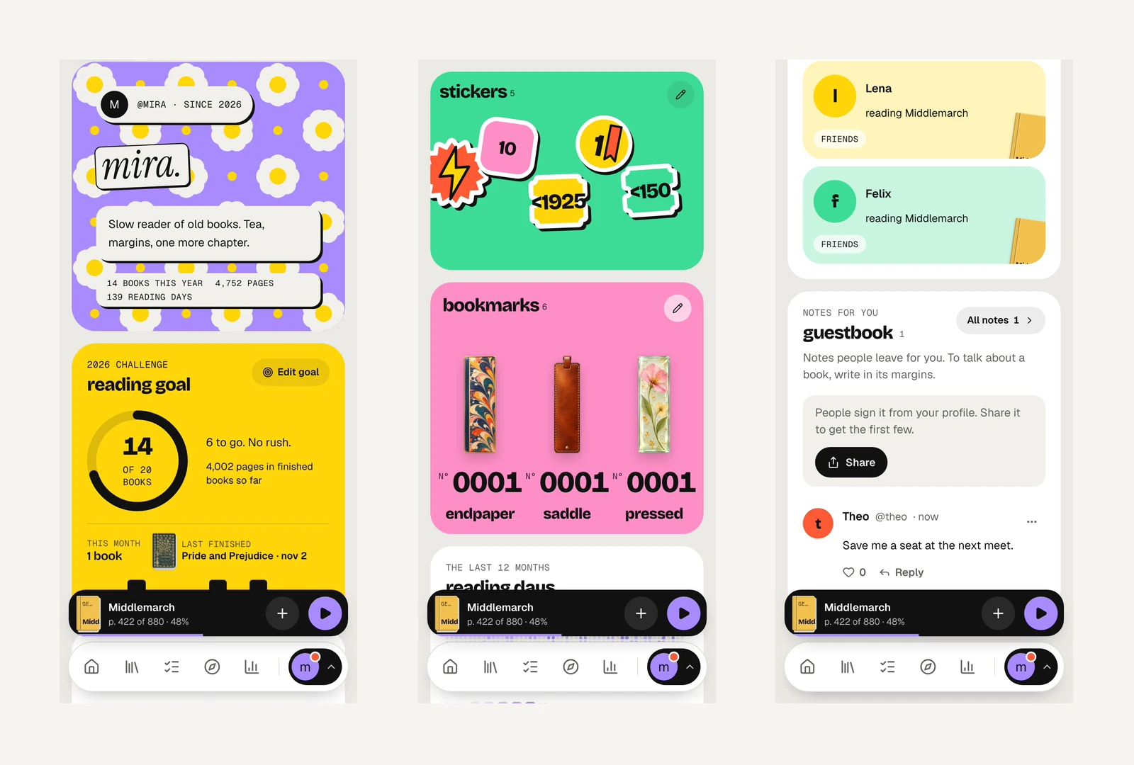
Readers get to choose a colour, a pattern, a name style, the background, the tile style and the corner shape, and can drag, resize or hide any tile, with many more customization options coming soon.
The guardrail is that every option is one I designed. Text colour switches by itself to stay readable on any choice, and a resized tile shows more content, not empty space. However a reader sets it up, it still looks designed.
- Interaction design
- Systems thinking
- Designing for user-generated layouts
05, Tracking that stays out of the way
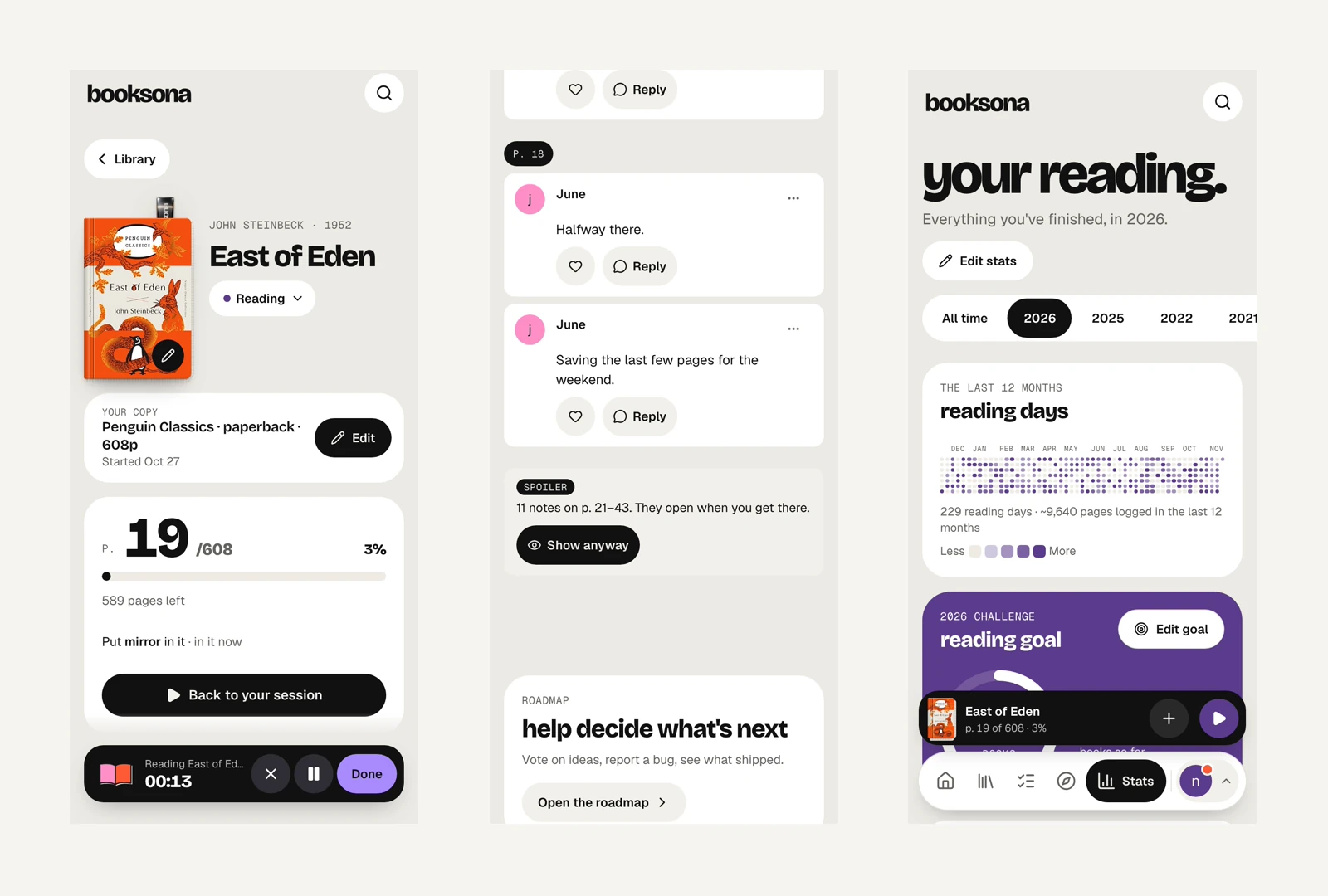
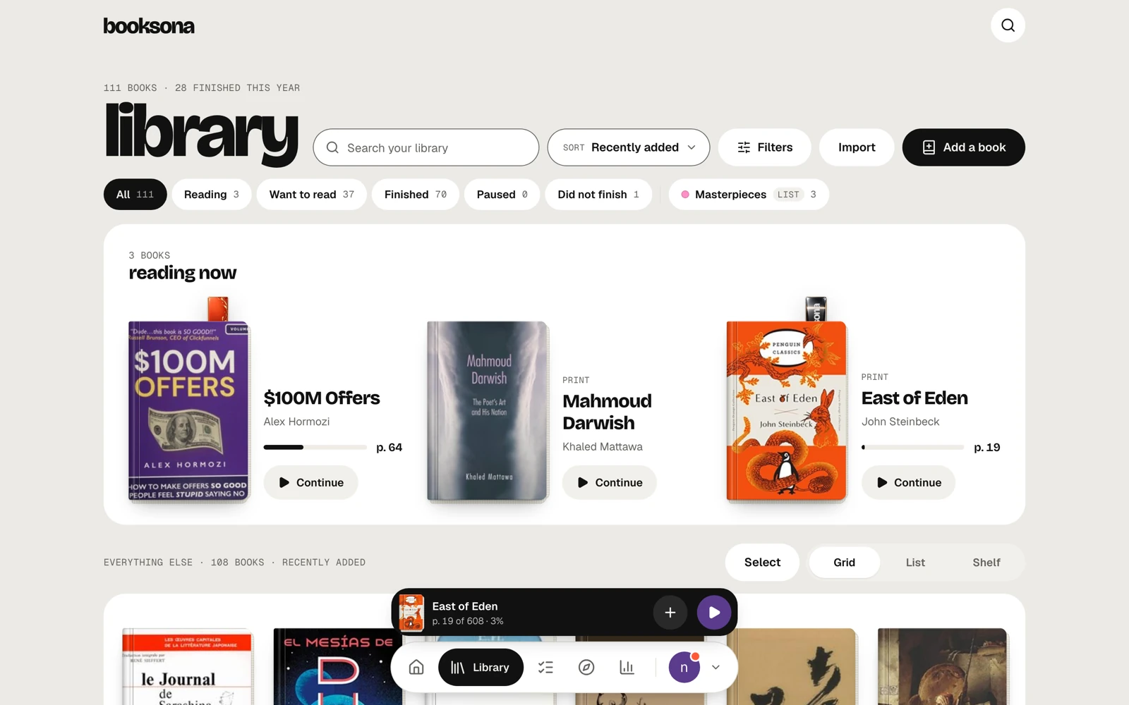
I mapped the whole product as the Booksona Journey, from first visit to a year of reading, then spent the most time on the flows people repeat daily.
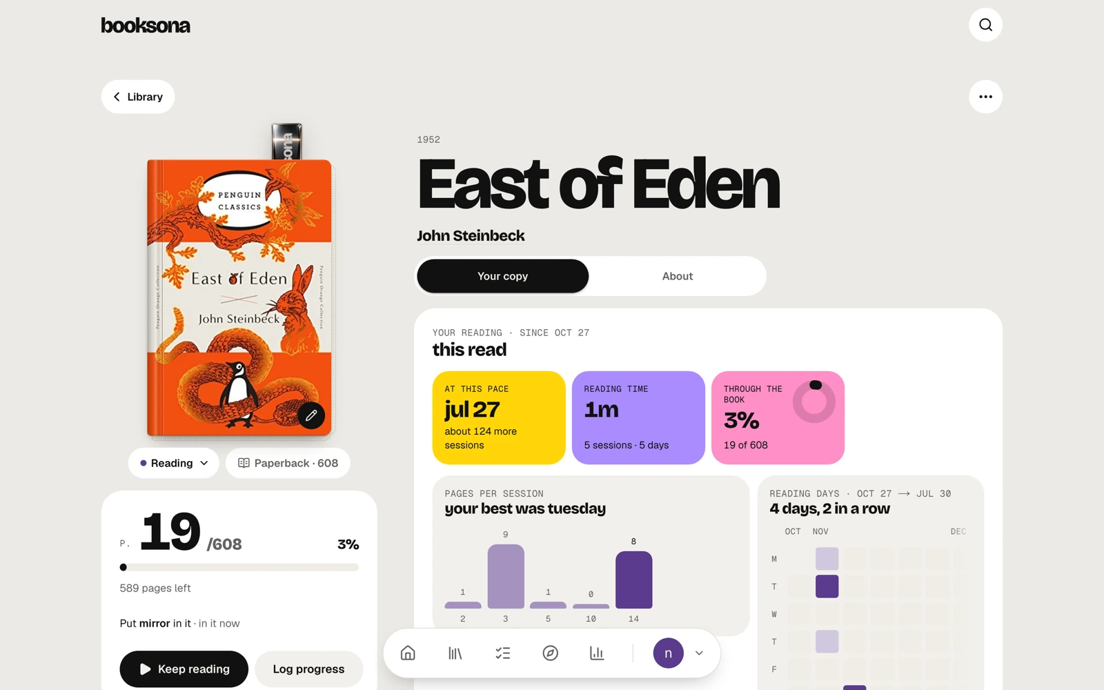
- Information architecture
- User flows
- Journey mapping
06, Small things, earned
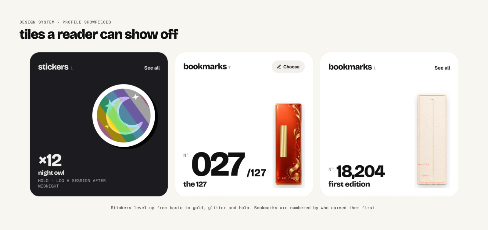
Rewards are where most apps add pressure. I designed them as keepsakes.
Stickers come from things you actually did, like finishing an 800-page book or reading after midnight. Earn one again and it gets shinier, from basic to holographic. Bookmarks are rarer and numbered by who got there first. You keep everything, even if you take a month off.
Stickers peel off a backing sheet, bookmarks unwrap, and pages fold with real fold geometry.
- Illustration
- Motion design
- Reward design without dark patterns
07, Reading together
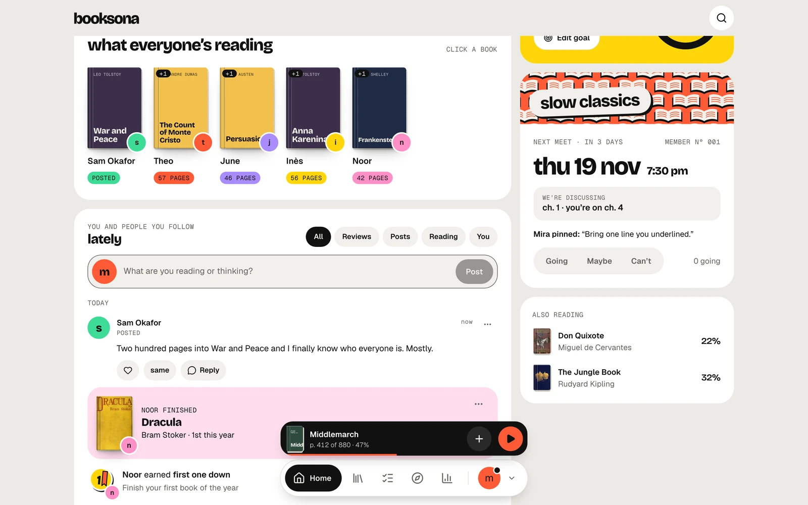
The social side is small and warm on purpose: friends and clubs, not a feed of strangers.
- Home shows your friends: what they are reading, their thoughts on their books, their reviews and their achievements.
- Clubs are where you and your friends read one book together, schedule chapters and talk about the book in a dedicated section, with no spoilers, because Booksona knows which chapter you’re on.
- Challenges give the whole app a shared goal, with rewards for finishing them.
- Social product design
- Privacy by design
- Moderation
08, Accessibility
Accessibility was never a pass at the end. It’s built into the design system, so every new screen gets it for free, and it’s tested on every change.
- Keyboard, Every page starts with a “Skip to content” link, and every focusable thing gets a clear focus ring that is never turned off. Arrow keys move through segmented controls, the reading-days heatmap, the club chapter tracker and the command palette. Cmd+K or / opens search from anywhere, G plus a letter jumps between pages, and readers can switch shortcuts off. Sheets and dialogs trap focus, close on Escape, and hand focus back to where you were.
- Screen readers, Icons never stand alone: every icon-only button has a label. The profile button in the dock reads out your unread count, status dots carry hidden text, and charts like the club tracker describe each column in words. Spoilers stay hidden from screen readers too, not just blurred on screen.
- Reading comfort, Readers can switch the whole app to OpenDyslexic, free for everyone. Light, dark or system theme is applied before the first paint, so there’s no flash. With reduced motion on, every movement turns into a short fade, and loops stop.
- Colour and touch, Every text and background pair in the token set is checked for WCAG AA contrast in both themes by an automated test, so a colour can’t ship if it fails. Tap targets are at least 44 by 44 pixels everywhere, even when the button looks smaller.
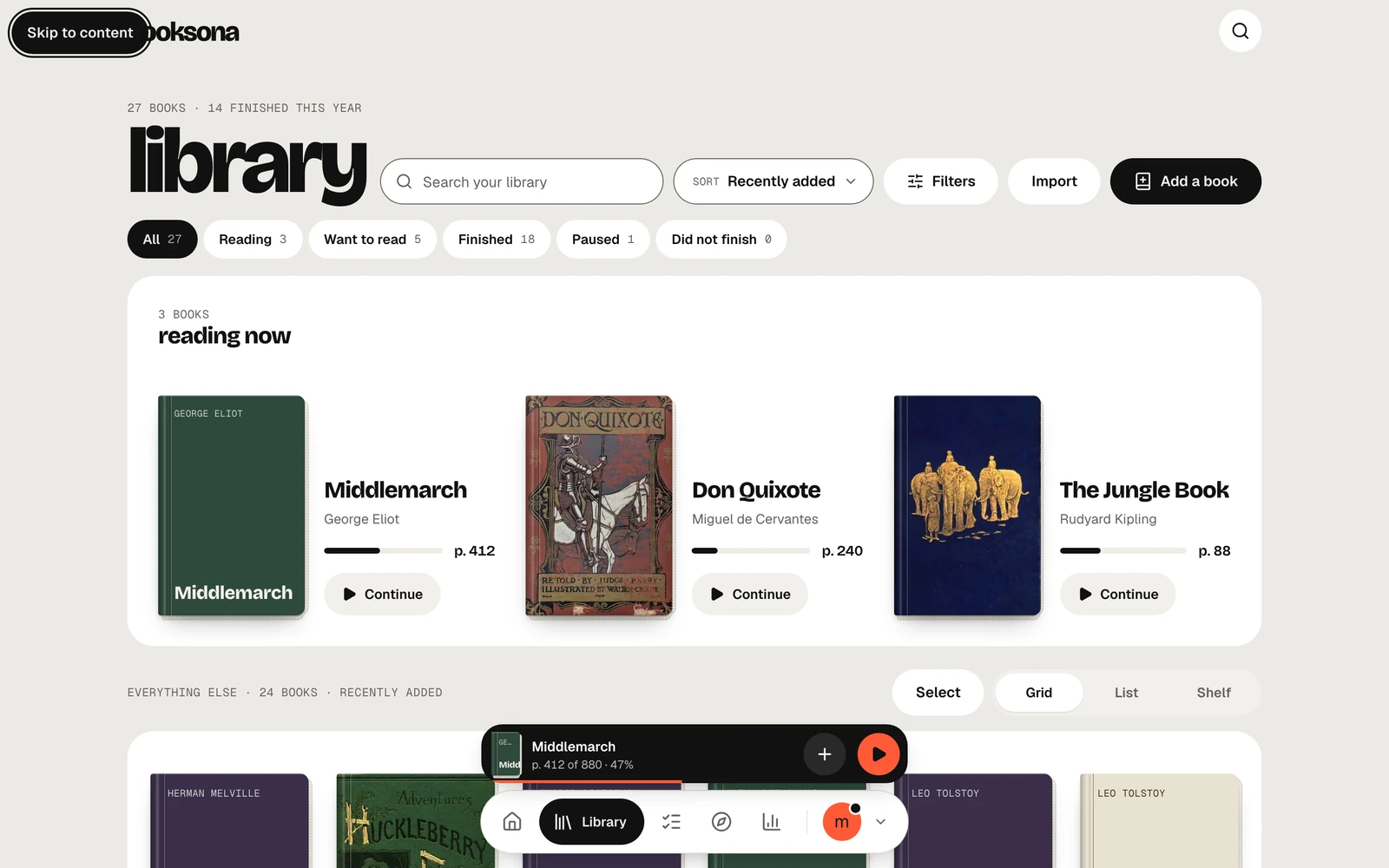
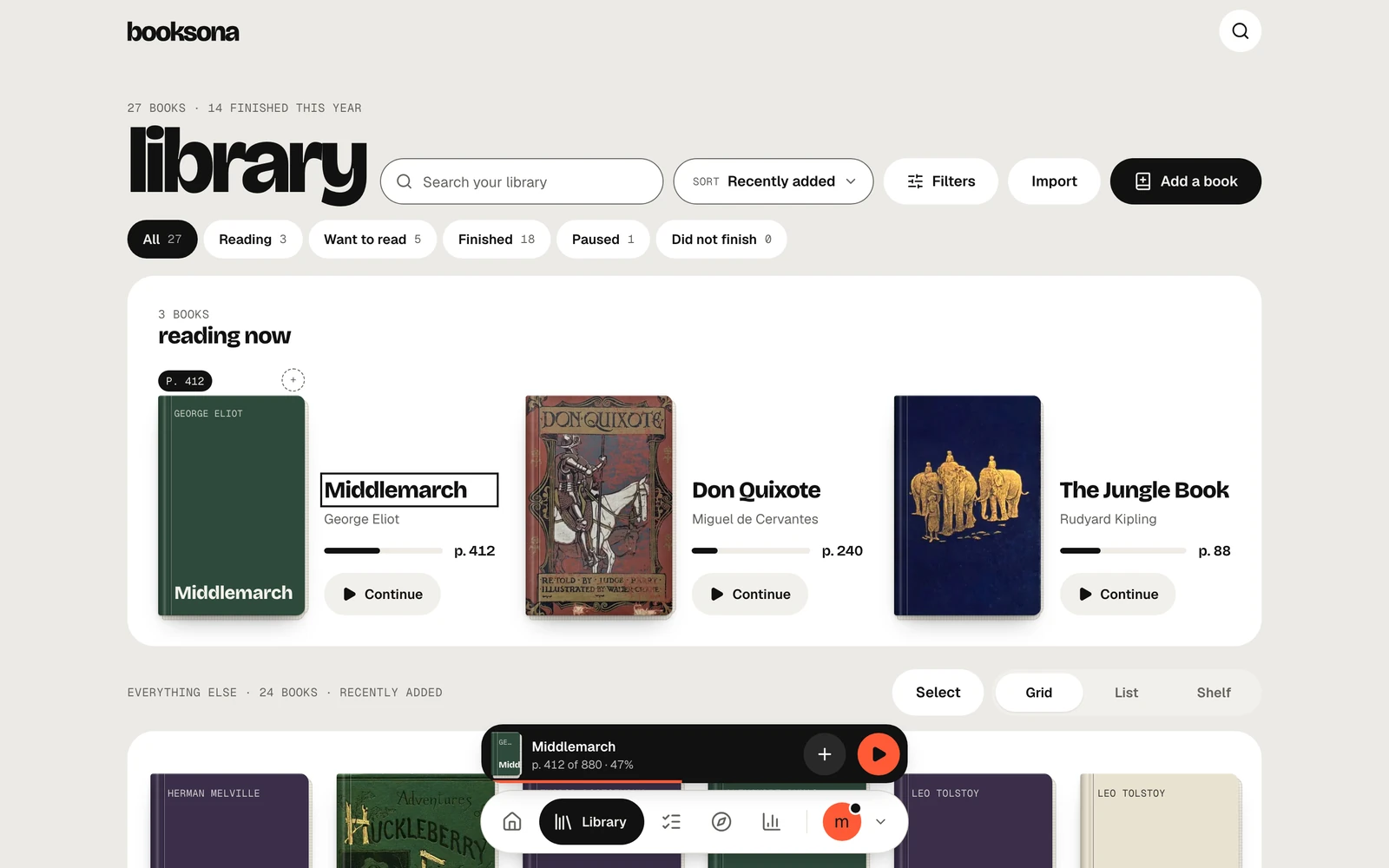
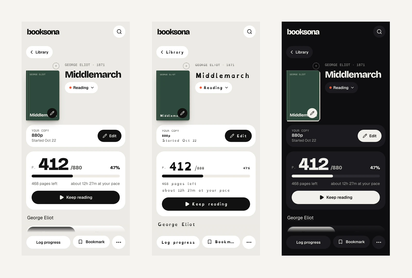
Tested, not assumed
- 58 routes, audited with axe against WCAG 2.2 AA, in light and dark, on phone and desktop
- 0 violations allowed, any axe issue fails the run, whatever its severity
- Open states too, sheets, menus and dialogs are audited while open
- Before every push, the full suite runs before any change ships
Automated audits catch what a machine can. The rest I find by using the app myself, and the next step is testing it with people who rely on assistive tech every day.
- Accessibility
- Inclusive design
- Automated testing
09, How I built it
I work as a design engineer, so I designed in Figma and shipped to production myself. I used AI coding agents to help write the code. The product decisions, the design, the specs, the review of every change and the quality bar were mine. AI is a tool that helps me achieve my vision. I never let it lead.
Of course, that only works with a strict process, so I built one:
- Spec, A written spec and a decisions log, so every judgement call is recorded.
- 4,800+, unit tests, run on every change
- 749, end-to-end tests on every change, plus screenshot comparisons that catch visual drift
- Privacy, Built into the data model: row-level security on every table, and staff tools behind two-factor sign-in.
- Front-end and full-stack engineering
- Quality process
- Working with AI tools
10, What I’m learning
The app has gone through a lot of changes since the beta started. It confirmed once again that user feedback is a designer’s best friend, and it also confirmed that the product is useful.
Many users have told me that they are reading more books, that they enjoy customizing their profiles, that their stats are helpful, that seeing their friends on the home page motivates them, and that they simply enjoy using the app.
Their feedback has shaped the app into what it is today, and I couldn’t be more thankful to them.
What I’d do differently: I knowingly fell into the trap of adding too many features before testing, and I had a fun week of fixing errors and nothing else. Next time, I would launch the beta with fewer features, get those solid, and then start adding more xD
Everything here is subject to change as the beta progresses.









COMMENTS (2)
Lazyleaf
“Naram is an awesome designer that has helped us deliver a multitude of projects for our clients (website design, graphics & product design). I enjoy his hands-on approach, the consulting that comes along with his services, and the accountability demonstrated throughout our collaboration.”
Goodwood Tree
“Naram is an excellent web designer, who excelled in delivering a quality product in an efficient and effective manner. He was specific in understanding my goals, and also kind enough to explain some of the finer points of web design. His prices were reasonable for the top-notch work he performs, and I’d 10/10 recommend him for any web design needs you may have!”