PropertyCard’s users were 40 to 75 years old, and most of them couldn’t find the home button.
PropertyCard · PRODUCT DESIGN · WEB · RESPONSIVE-FIRST
Neither could I, and I have a computer science degree.
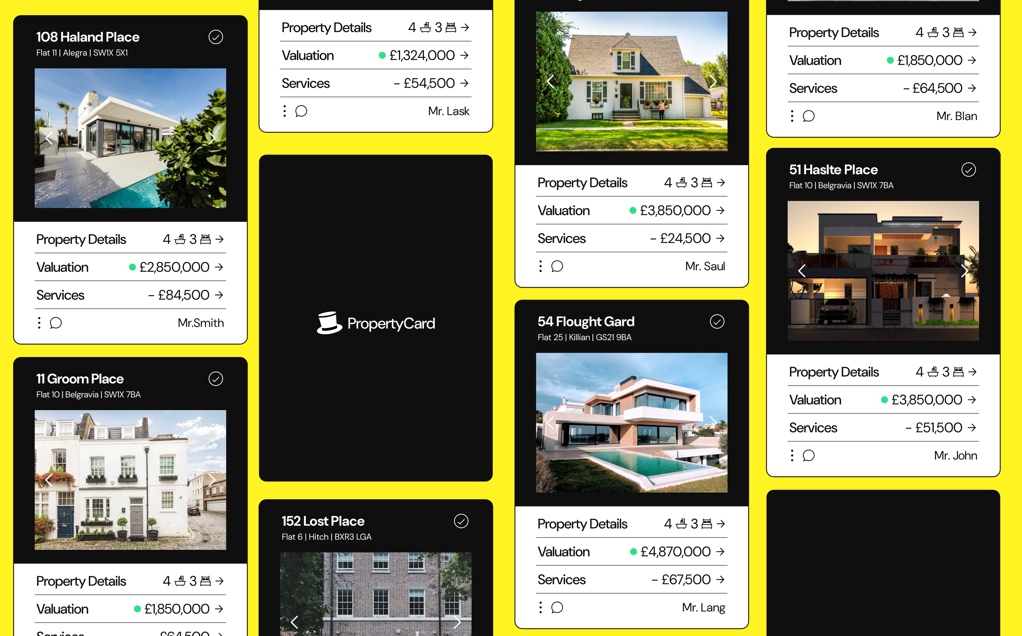
A 12-month redesign of a property-management platform for landlords and tenants, rebuilt around three interaction rules and a custom design system, built so that people with zero technical background wouldn’t have to learn software to manage their own property.
SNAPSHOT
- status
- built and handed off; the platform was mid stakeholder changeup during my time and shut down before the redesign reached its landlords
- Role
- Product Designer, research, UX, visual design, prototyping
- Team
- Solo designer working with a team of 2 engineers
- Timeline
- 12 months, 2021–2022
- Platform
- Web, responsive-first
If you read nothing else
- The problem: Managing your own property meant fighting software. Landlords aged 40 to 75 were abandoning basic tasks because the platform demanded technical skill they did not have.
- What I did: Rebuilt every flow around three familiar interaction rules and a custom design system, over 12 months.
- What changed: Managing a property became a series of familiar actions: flip a switch, tap a button, fill a form. Test users in the right age range completed their journeys and retraced their steps without getting lost.
01, A product built for a user who didn’t exist
PropertyCard was a platform for landlords and tenants to display properties and manage the recurring monthly and yearly services attached to them. Property managers used it too, some handling large portfolios.
The problem wasn’t the idea. It was that when I joined, the existing design demanded real technical expertise just to navigate. Our actual users were homeowners and landlords between 40 and 75 years old, in line with the UK’s landlord demographics: the median landlord in England is 59, and about two thirds are 55 or older. Many of ours described themselves as uncomfortable with technology. The product was built for an imaginary tech-savvy user, then sold to people who couldn’t use it. (source: English Private Landlord Survey)
That gap became the design brief: a platform that requires almost zero technical ability.
02, The evidence
Between my own audit of the product, watching people use it, and what the team knew from customers, the problems clustered into five:
| The problem | How I know it was real |
|---|---|
| Basic navigation was unlearnable | It took me five minutes to find the home button |
| Users feared getting lost or breaking something | Watching people use the product, the pattern was consistent: the moment they felt lost, they panicked |
| Unfamiliar controls overwhelmed low-tech users | Every novel widget was one more thing a 70-year-old landlord had to learn before doing their actual task |
| Full-screen context switches disoriented people | When the whole screen changed, users lost track of where they were and what they’d done |
| The product assumed technical literacy its audience didn’t have | Our users were 40–75; the interface was built for people who live in software |
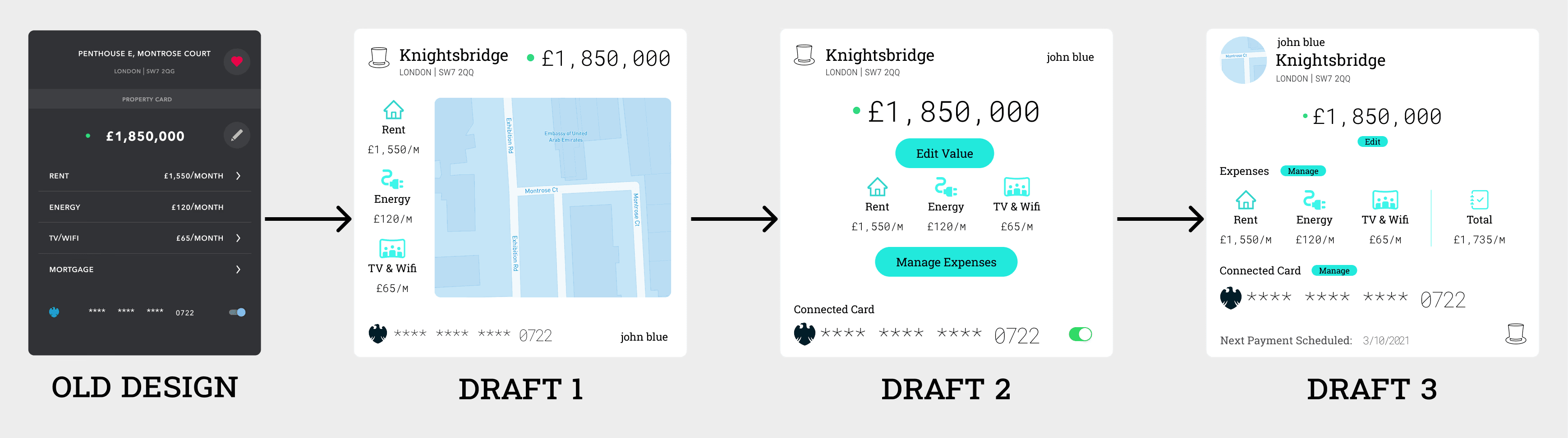
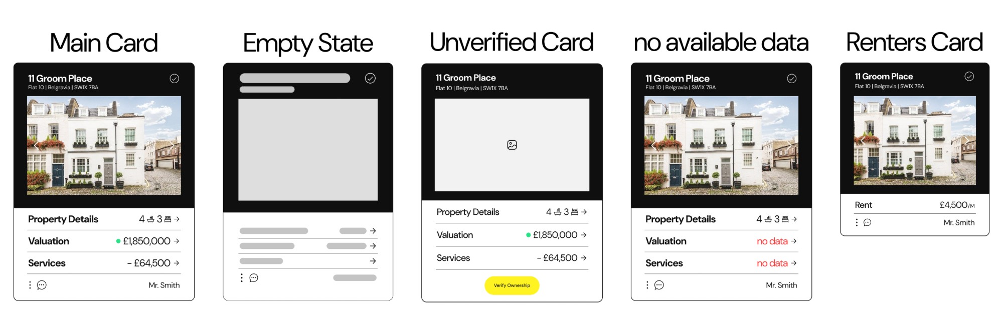
The old card, then three drafts. The information barely changed; what changed is how much of it you had to decode before you knew what your property was worth.
03, The constraint that made every decision
Designing for people with limited technical ability sounds like simplification. It’s actually constraint design: every screen has to answer “what can go wrong for someone who has never used software like this?”
Watching users interact with the product during testing, I kept seeing the same two failure patterns: people got overwhelmed by unfamiliar interaction types, and people panicked the moment they felt lost. So the redesign was built on three rules.
Rule 1: Only three interaction types exist
- Switches → for toggling
- Buttons → to navigate or trigger actions
- Forms → only when input is absolutely necessary
Everything a user encounters either flips, goes somewhere, or asks for something. These mimic real-life behavior, a light switch, a doorway, a paper form. No surprises, no novel widgets to learn.
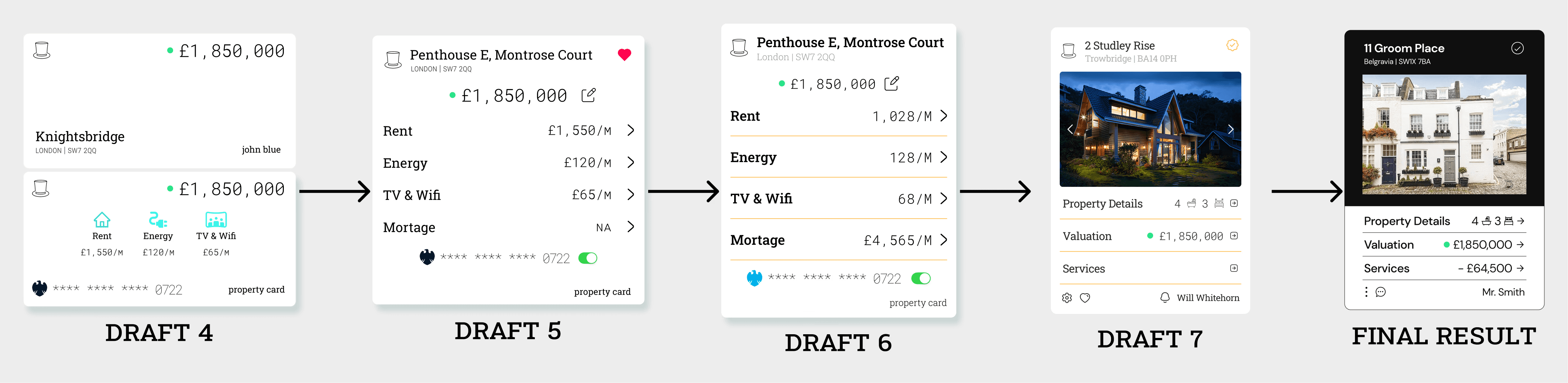
Drafts 4 through 7. Every step is the same move: one more novel control removed, one more row that behaves like every other row.
Rule 2: Always a way back
One of the first things testing taught me: people panic when they feel lost. So every screen, every step, every click got a clear path backward. No dead ends. Clean, reversible flows that respect human error, because for a 70-year-old landlord, an unrecoverable mistake isn’t a UX flaw, it’s the reason they stop using the product.
Rule 3: Everything lives in cards
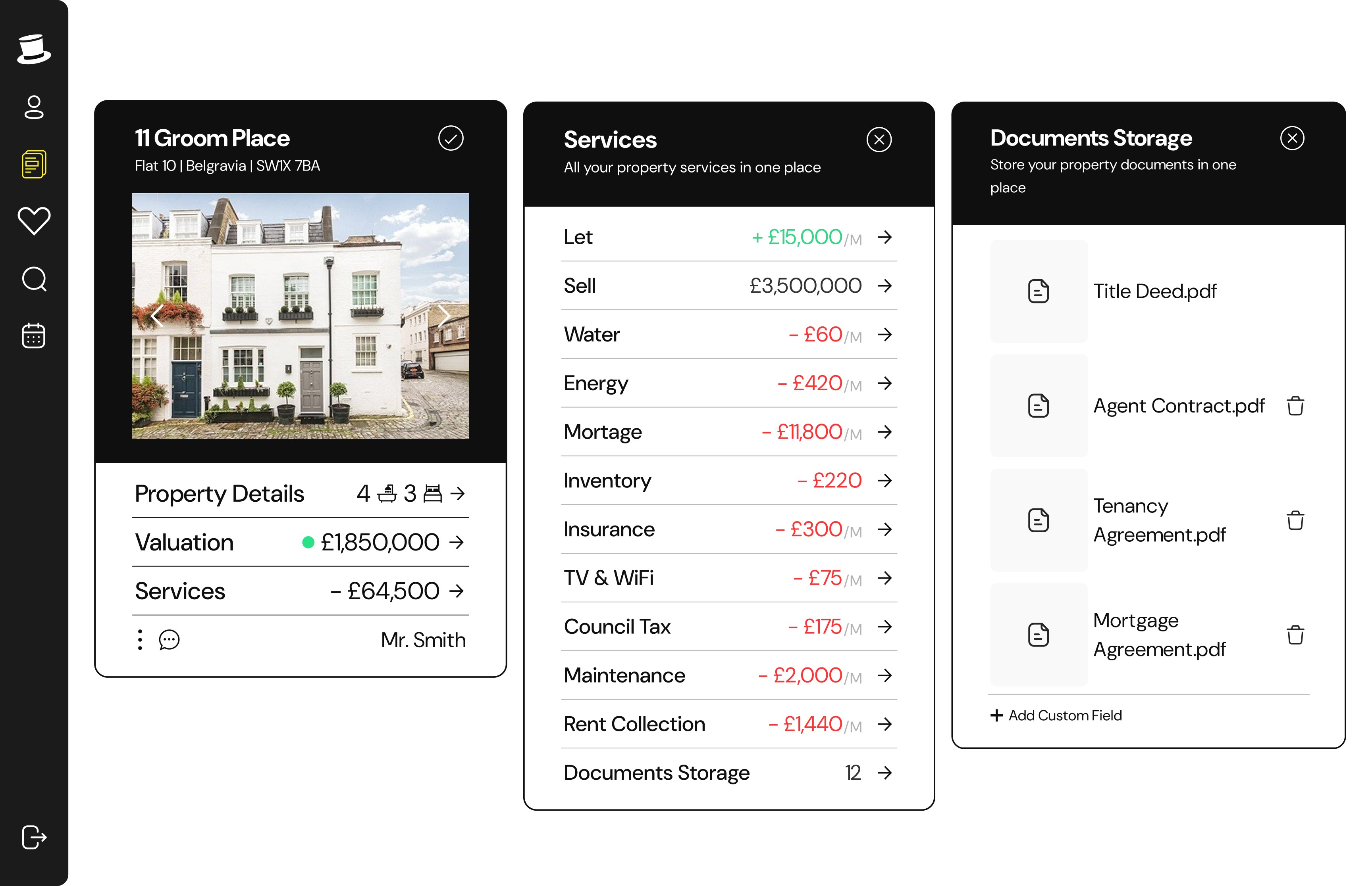
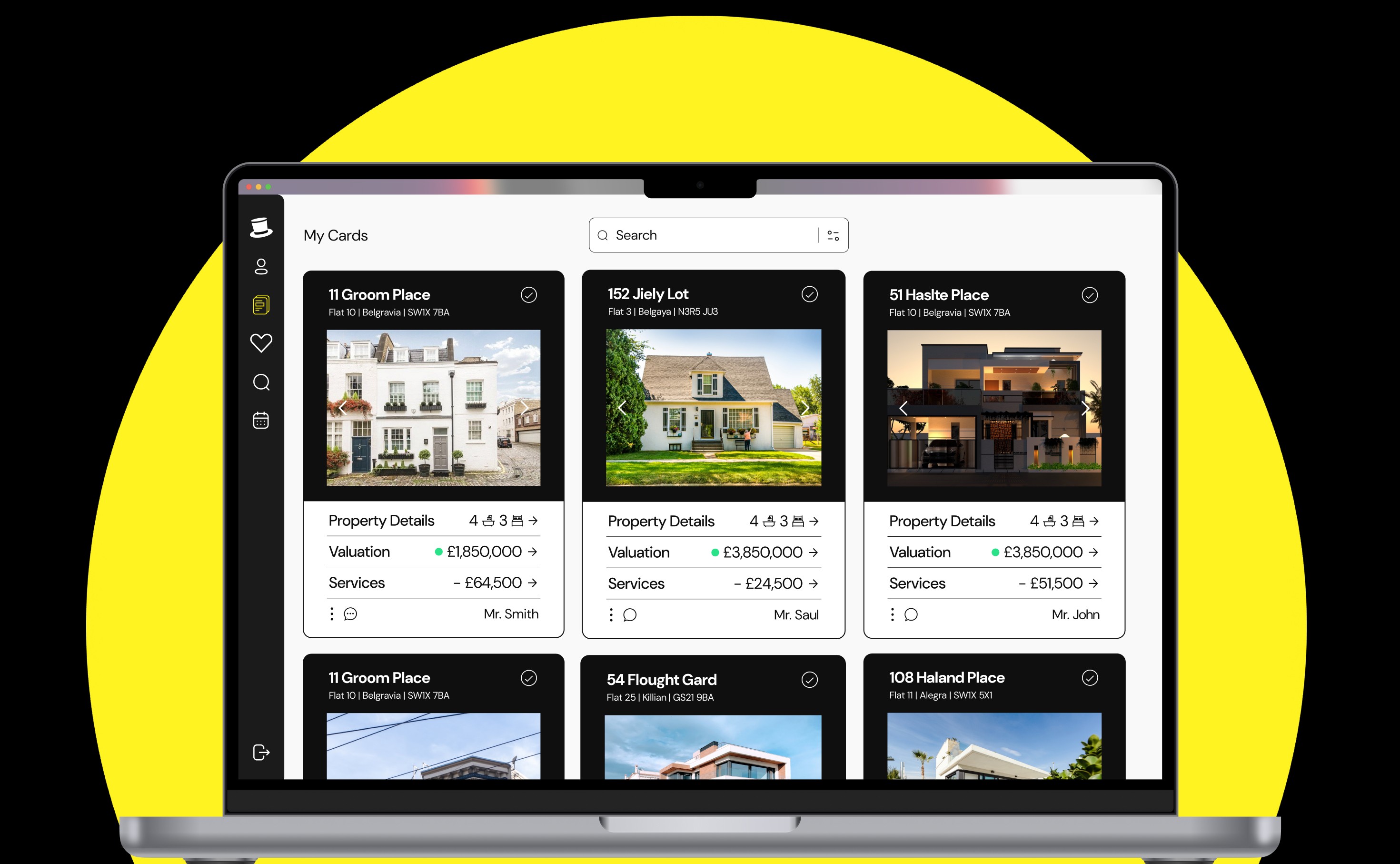
Each action opens a new card instead of replacing the whole screen. In testing, users responded strongly to this, the experience stayed modular and digestible, and users never lost the context of where they were. It also happened to fit the product’s name, which made the pattern easy for the whole team to rally around.
04, A system that had to hold up on screens I would never design
The redesign wasn’t a facelift, it needed to hold up at scale. In 2021, the private rented sector accounted for 30.1% of all households in London, equating to over one million occupied dwellings, and a single property manager could be handling 40–200 properties. Whatever I built had to stay consistent across thousands of screens I would never personally design. (source: Trust for London)
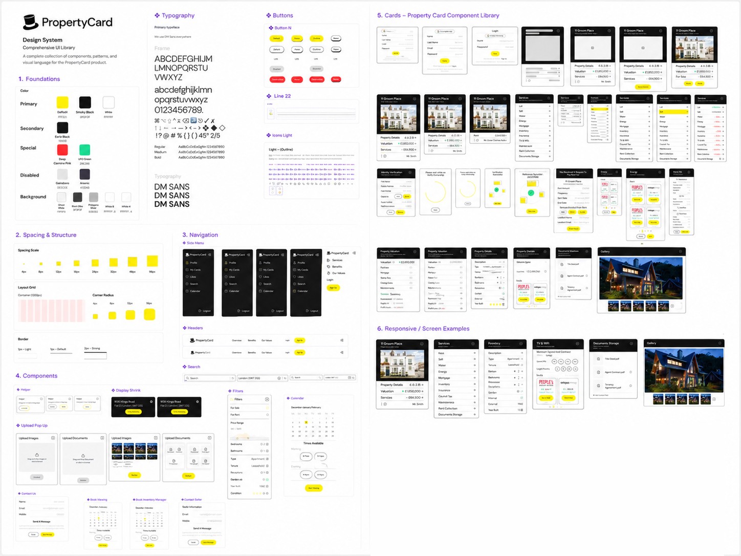
So I built the system atomic-first: components at the bottom, patterns built upward, a full custom component library, every piece of it encoding the three rules above, so consistency wasn’t a style guide anyone had to remember. It was the only way the tools worked.
Responsive was the other structural bet: start small, scale up, with auto layout doing the enforcement.
One component, anatomized
05, Components that behave like CSS, because I built them that way
My Computer Science background influenced how I structured the work. I treated Figma components as behavioural systems rather than decorative assets. Auto Layout rules were designed to mirror frontend layout logic:
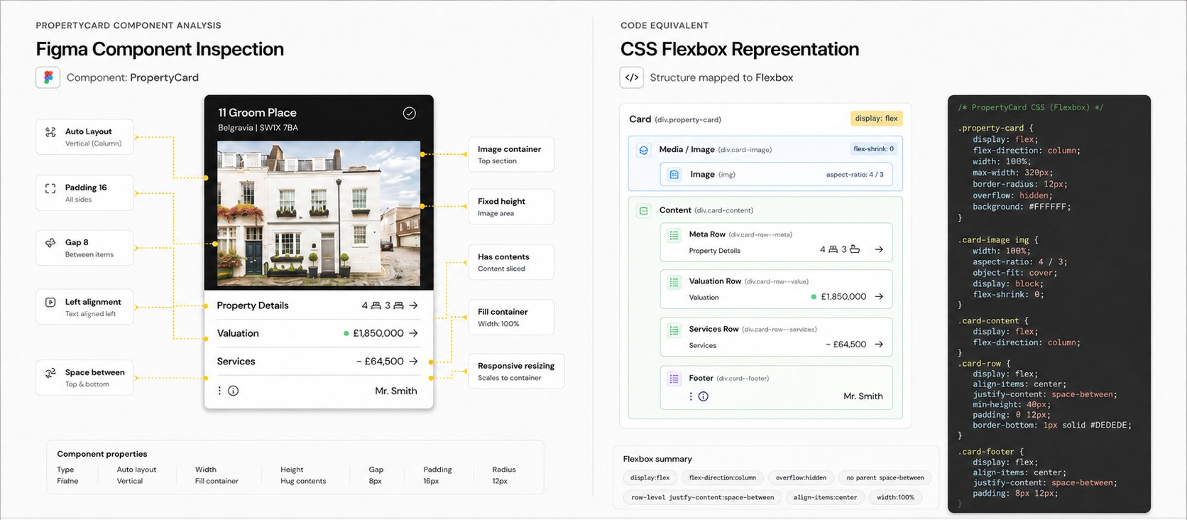
The parent card remains tightly stacked. justify-content: space-between is used at the row level, where labels and values sit on opposite sides.
06, What I couldn’t measure, and what I’d have measured
Here’s the honest part: the company shut down before the redesign’s impact could be measured over time, so I can’t show you a retention curve. I was only able to confirm my design choices by testing it out on fellow teammates, older family members, and friends, but they were not the target users, so those observations only speak to a certain extent to verify the need for change. What I can tell you:
- Users were able to complete most of the journeys, and when asked to retrace their steps, they did without getting lost or confused.
- Stakeholders approved the design change stating “Seeing the property, finally makes it feel real.”
If the product had lived, these problems gave me the scoreboard I’d have watched: onboarding completion rate (against “users quit halfway”), time-to-first-successful-task for new users (against the learning curve), and support contact volume (the cheapest proxy for “people feel lost”).
I never got those numbers, the product folded before there was anything to measure. But I still know exactly which ones I wanted, and that’s the part I’d carry into the next system.
07, Reflection
- If I did this again: I’d document research as I went. The original findings lived on a whiteboard in 2021 and were never written down properly, a mistake I haven’t repeated since. What survives is what mattered: every finding is still legible in the decisions it produced.
- I’d also test with actual target users earlier, instead of relying on proxies like teammates and family. And today, AI would let me analyze market data and user complaints before ever walking into an interview, better prepared, not replaced.
- What surprised me was how difficult it was designing for non-technical people. There are sections where it would be obvious for me, but when I needed a quick test, I would put the product in front of my dad and ask him to go through it, and he would get stuck. It helped me build the skill of putting myself in the user’s shoes.
This is the project where I fell in love with design systems.













COMMENTS (2)
Lazyleaf
“Naram is an awesome designer that has helped us deliver a multitude of projects for our clients (website design, graphics & product design). I enjoy his hands-on approach, the consulting that comes along with his services, and the accountability demonstrated throughout our collaboration.”
Goodwood Tree
“Naram is an excellent web designer, who excelled in delivering a quality product in an efficient and effective manner. He was specific in understanding my goals, and also kind enough to explain some of the finer points of web design. His prices were reasonable for the top-notch work he performs, and I’d 10/10 recommend him for any web design needs you may have!”