I started with the wrong problem.
Florist Heaven · PRODUCT DESIGN · SELF-INITIATED CONCEPT
Properties
- role
- Product Designer
- type
- End-to-end app
- focus
- Research → UX
- testing
- 5-user study
- timeline
- 3 months
- scope
- Research, UX/UI, Usability Testing
If you read nothing else
- The problem: Plants keep dying after purchase. People buy on looks, get zero guidance on keeping them alive, and the store that sold them disappears after checkout.
- What I did: Researched, designed, and tested an app across three months: a store, care guides, and a personal garden in one place.
- What changed: Five-user testing killed my marketplace-first version. The product became a care companion where buying a plant is the start of the relationship, not the end of it.
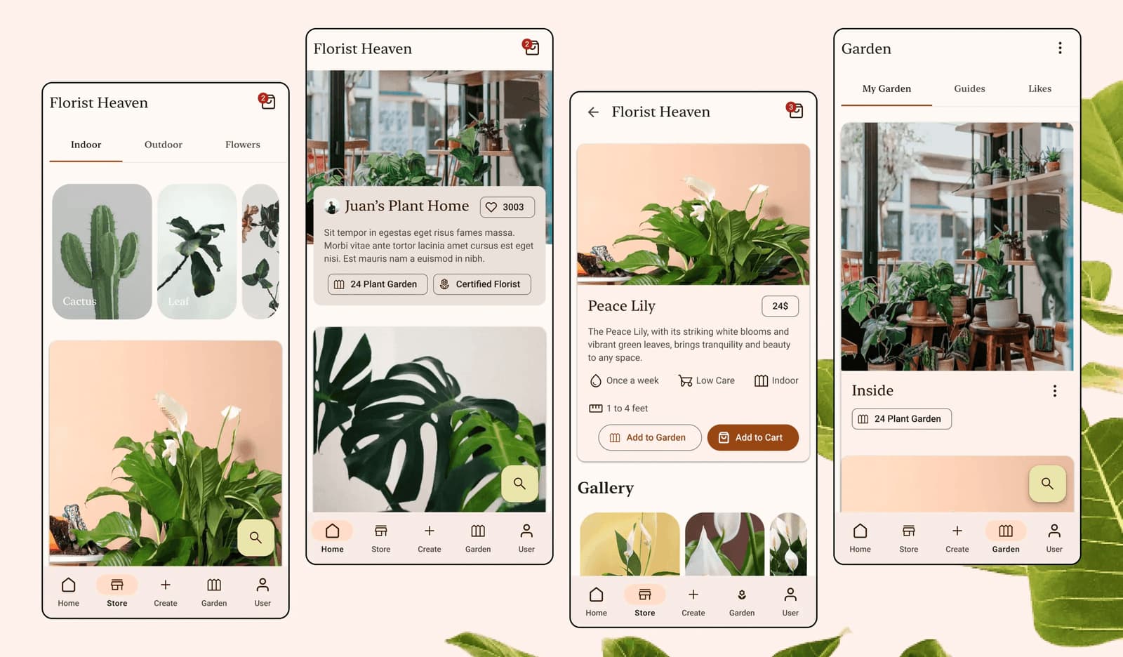
Florist Heaven started as a storefront for florists, and became a place where regular people could actually keep their plants alive.
01, The interviews changed the brief
Florist Heaven began as a marketplace, a better place for florists to showcase their work and for plant enthusiasts to discover and purchase plants. Then I started talking to users. What I found was more interesting.
People did not just need help finding plants. They needed help living with them.
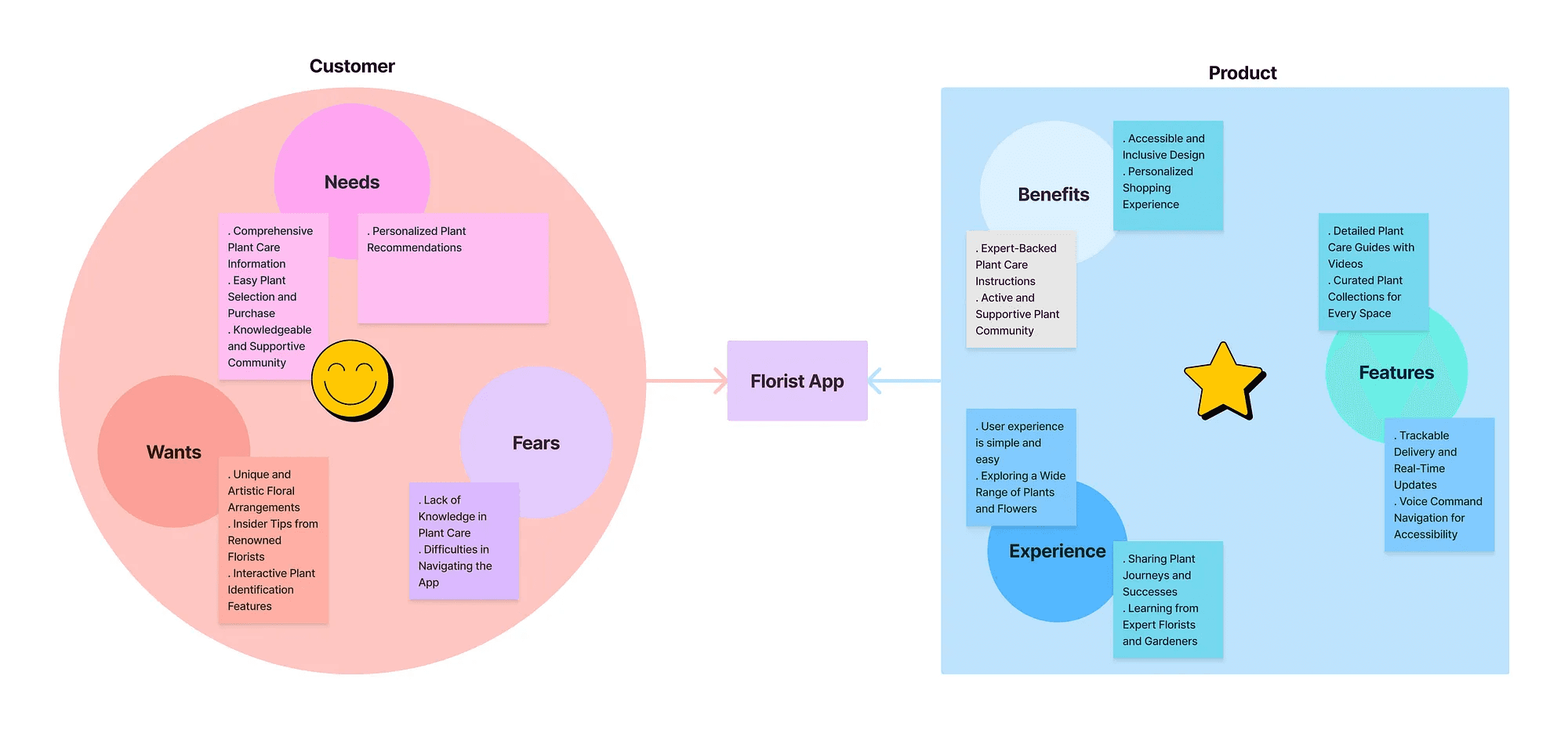
Research showed stronger demand for accessible care guidance (5 in 7 of my sister’s plants died), easier product creation for florists, clearer pricing, and a more personal way to manage the plants users already owned. That changed the project.
- A marketplace for buying plants → A companion for discovering, learning, buying, and caring for them
02, Understanding the ecosystem
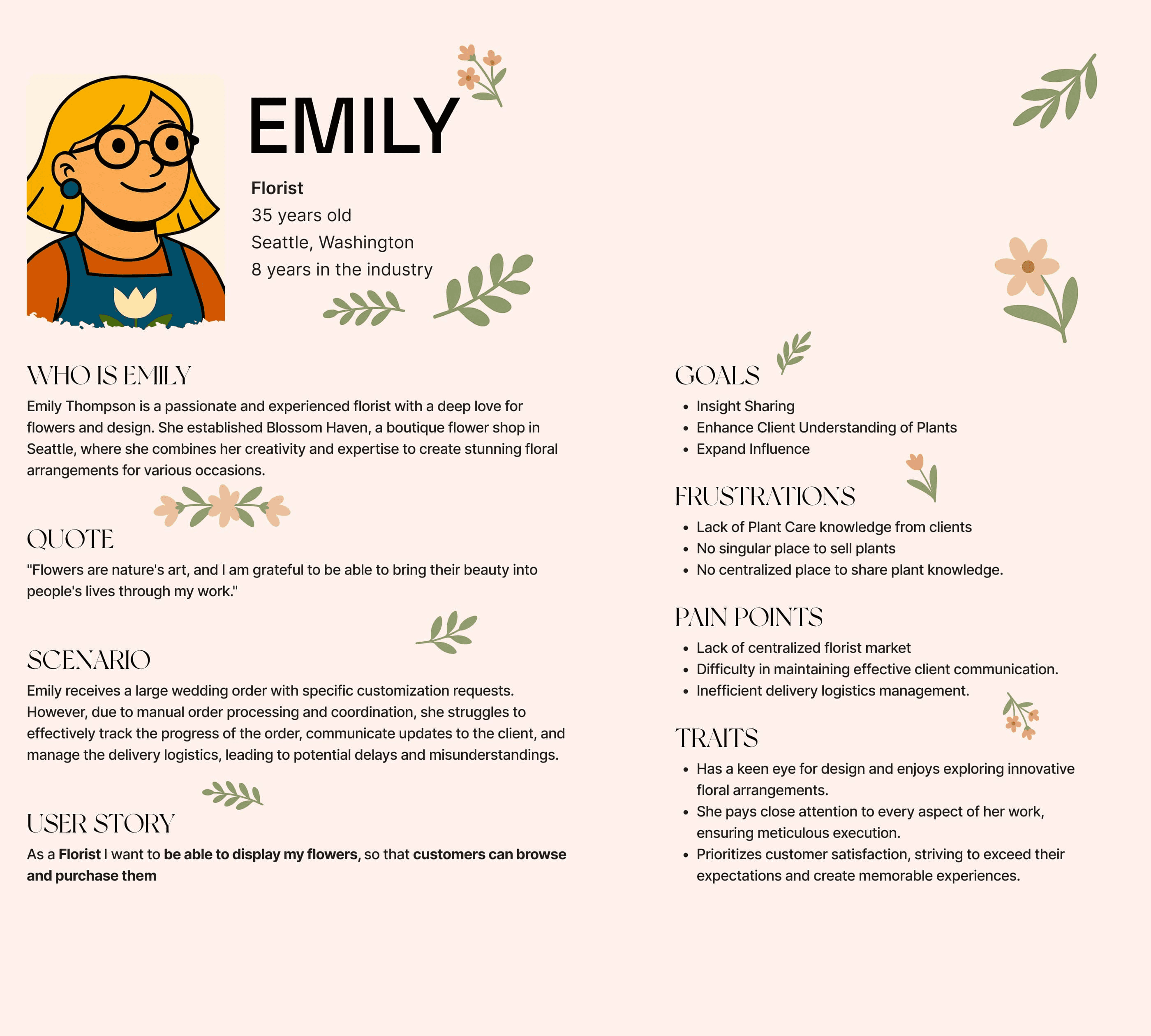
I interviewed five people, three florists and two plant enthusiasts, and ran a small survey on how people discover, buy, sell, and care for plants. Small numbers, gathered fast, not a formal study. Four recurring points of friction surfaced.
- “How do I actually care for this?”, Plant information was difficult to find and often too dense.
- “Why does posting this take so long?”, Florists needed a faster way to publish large numbers of products.
- “Why am I only seeing the extra cost now?”, Pricing and customisation needed to be transparent earlier.
- “This is supposed to be my garden.”, Users wanted ownership and personalisation over their digital plant collection.
03, The insight that changed the product
The transaction ends. Plant ownership does not. My original mental model was Discover → Buy. Research suggested a much longer relationship:
Discover → Understand → Buy → Care → Learn → Share
The marketplace remained important, but it was no longer the entire product. The new opportunity was to connect commerce with ongoing plant ownership.
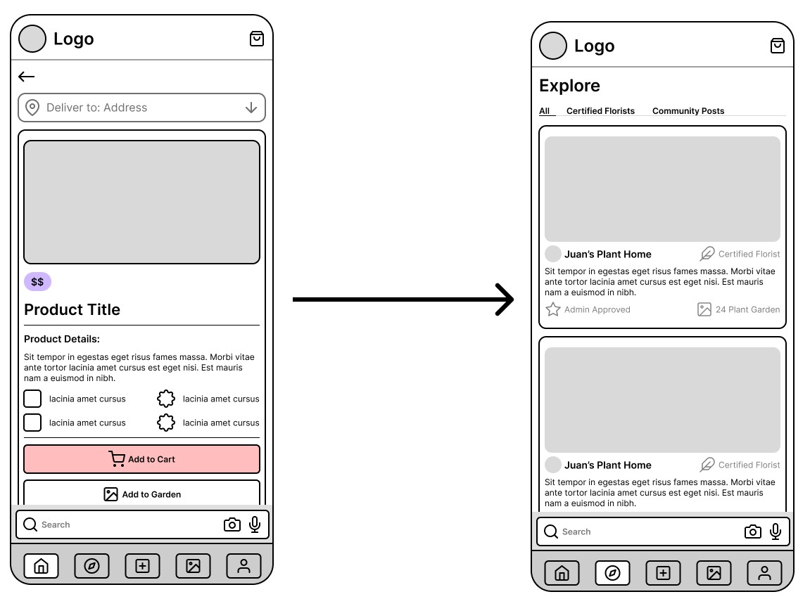
I considered keeping the Store as the home screen and treating care as a secondary tab, the safer version, and the version that makes money on day one. The interviews are what flipped me to companion-first; later, testing confirmed it, 4 of 5 testers couldn’t tell the store-first Explore from a search bar. The cost is real: commerce now has to earn attention from inside Home and Garden instead of owning the front door. That’s the tradeoff I’d have to defend to a business, and I’d defend it.
04, Turning research into a product
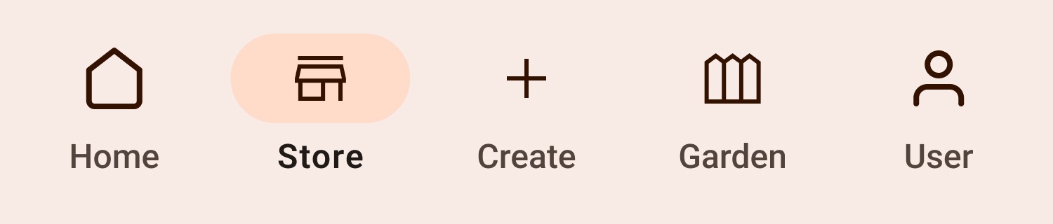
- Home, Learn from plant-care content and community knowledge.
- Store, Discover and purchase plants and floral creations.
- Create, Publish a product or share knowledge without unnecessary friction.
- Garden, Organise owned plants, collections, and saved guidance.
- Profile, Build identity and credibility, certified florist indicators help users judge professional contributors.
05, Then I put the prototype in front of people
I kept the prototype deliberately rough, the goal was people reacting to the ideas, not the styling. I tested with five participants, chosen for varied technical confidence and plant experience. The testing exposed four decisions worth changing.
One honest gap: all five testers were plant owners, not florists. The florist side of this product, Create, certification, publishing, rests entirely on the discovery interviews and has never been put in front of a working florist. That’s the first thing I’d fix.
- 4 of 5, felt Explore added little beyond search (“So the difference is I can search now?”), I repositioned the product from store-first to plant companion, making discovery about care knowledge and user-created guides.
- 4 of 5, did not want to be pulled away from browsing after adding an item, I replaced the forced cart redirect with a bottom-sheet interaction.
- 5 of 5, reacted negatively to the original Garden, I introduced custom lists, editable imagery, saved guides, and clearer management controls. Less database, more personal space.
- 4 of 5, wanted answers, not articles (“I just want to see how and when to water my plant”), I introduced icon-led care sections for watering, light, and other needs.
- Store-first → Companion-first
- Forced cart → Non-disruptive bottom sheet
- Static Garden → Personal ownership
- Dense instructions → Scannable guidance
The biggest iteration wasn’t on any screen, I had to change my mind about what the product should be.
06, The final ecosystem
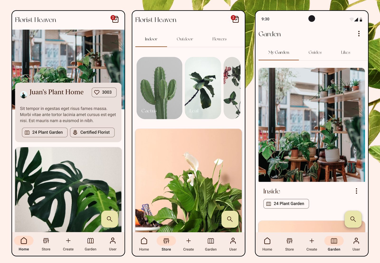
Learn, discover, create, grow, the five areas connected into one companion.
07, Designing beyond one viewport
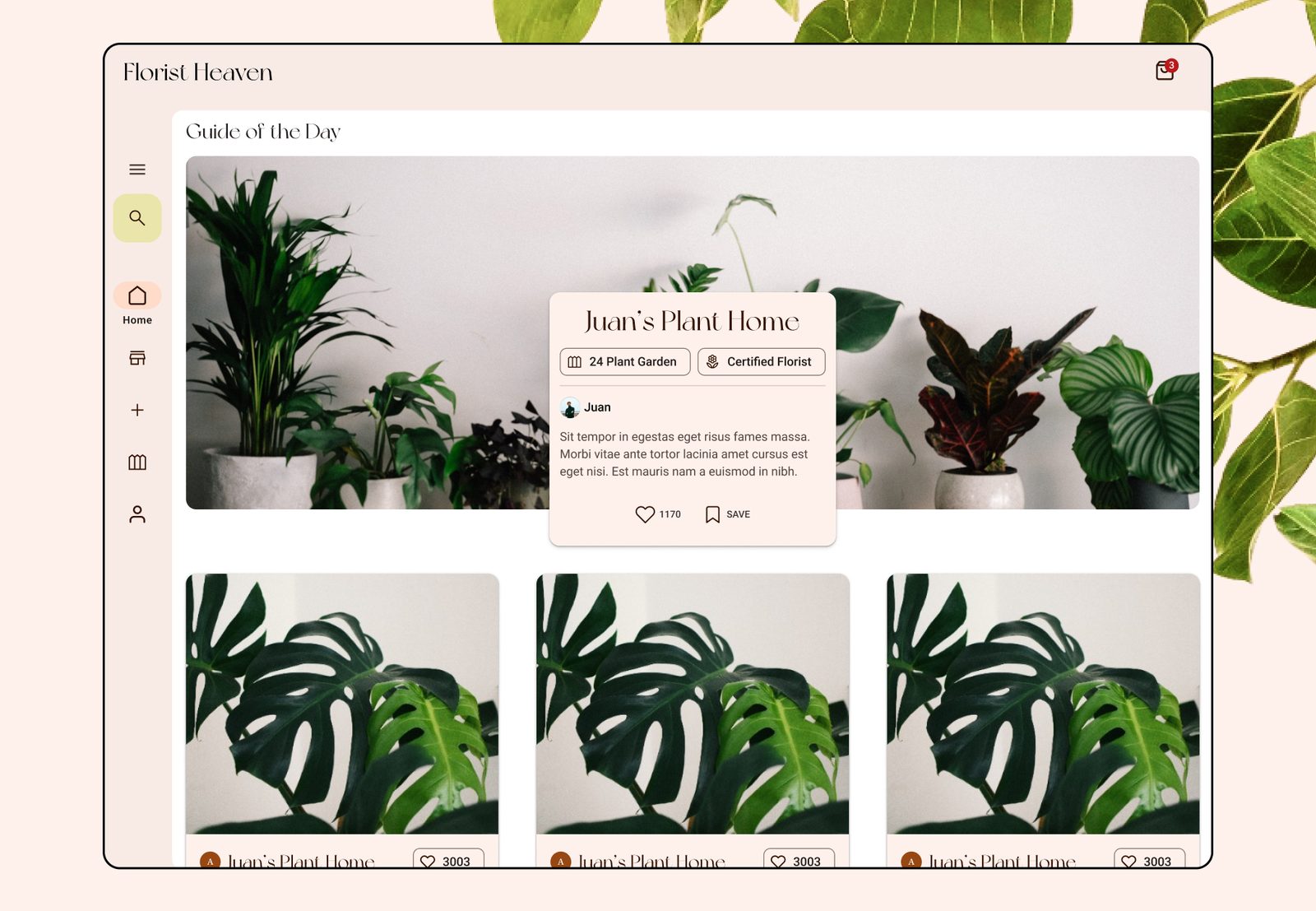
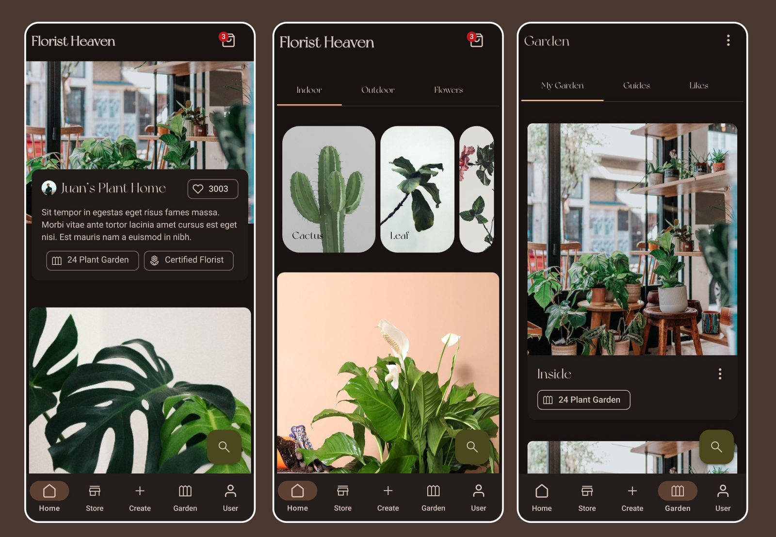
The final stage pushed the system beyond mobile. I adapted Florist Heaven responsively and explored dark mode on Material Design foundations, using Figma Variables as design tokens. It forced me to think about components as behaviours rather than fixed screens.
08, What I don’t know yet
Florist Heaven was never built, so I have no usage data, the only evidence is five people in a room with a prototype. If it shipped, I’d watch three things: how many users open a care guide for a plant they already own (does the companion model get used, or just test well?), the share of florists who publish a second product within a week of their first, and 30-day retention split by whether a user added a plant to their Garden. If care guides go unopened after month one, the companion thesis is wrong and this is a store again.
09, What this project changed in me
I came in to build a store. The users I tested with turned it into a companion. They were right.
Talking to users changed the product. My first draft was the version I designed from my own head, and I was sure it was the solution; testing showed it wasn’t close. Research into what users actually need and want turned out to be the most important part of designing for their problem. I became less attached to my first solution and more interested in the evidence that might prove it wrong.
The craft lesson ran alongside it: building the full product in Material Design, dark mode included, and adapting it for a web app taught me the system at a depth that reading the guidelines never did.










COMMENTS (2)
Lazyleaf
“Naram is an awesome designer that has helped us deliver a multitude of projects for our clients (website design, graphics & product design). I enjoy his hands-on approach, the consulting that comes along with his services, and the accountability demonstrated throughout our collaboration.”
Goodwood Tree
“Naram is an excellent web designer, who excelled in delivering a quality product in an efficient and effective manner. He was specific in understanding my goals, and also kind enough to explain some of the finer points of web design. His prices were reasonable for the top-notch work he performs, and I’d 10/10 recommend him for any web design needs you may have!”