INDUSTRY:
TECH
CLIENT:
TOTERS
YEAR:
2025
EXPERIENCE:
PRODUCT DESIGN

Toters: Butler
about.
I am to deliver a seamless, reliable Butler service experience for on-demand deliveries or purchases.
My Mission: Reduce friction across the ordering flow while keeping the Toters brand intact. I had 3 core objectives:
Reduce avg. order time by 20%
Cut backtracking steps by 30%
Decrease operations manual interventions by 40%
challenge.
Understanding the Users
Maya - The Busy Professional
Needs: Order essentials quickly mid-day without breaking focus.
Pain: Multi-step forms interrupt flow, lack of clarity.
Tech: Power user. Keyboard shortcuts, Slack, Asana, Gmail.
Karim - The Small Business Owner
Needs: Get the right car part quickly and accurately.
Pain: Techy menus, lack of reorder templates.
Tech: Moderate. Tablet POS, prefers clear flows.
Rana - The Stay-at-Home Mom
Needs: Order meals or groceries easily, share orders.
Pain: Unclear handoffs, hard to schedule recurring deliveries.
Tech: Mobile-first. Relies on push notifications and shared calendars.
research.
Customer Feedback
Took around 100+ Reviews from reddit and app stores and compiled them through AI to find common links. Here’s what stood out:
What users love:
“Deliver anything that fits on a moped”
Real-time tracking
Rewards & saved preferences
What frustrates them:
Long wait times, no response
Unclear pricing, high fees
Buggy GPS, frequent crashes
Poor customer support response time
What about me?
I walked through both current core Butler flows:
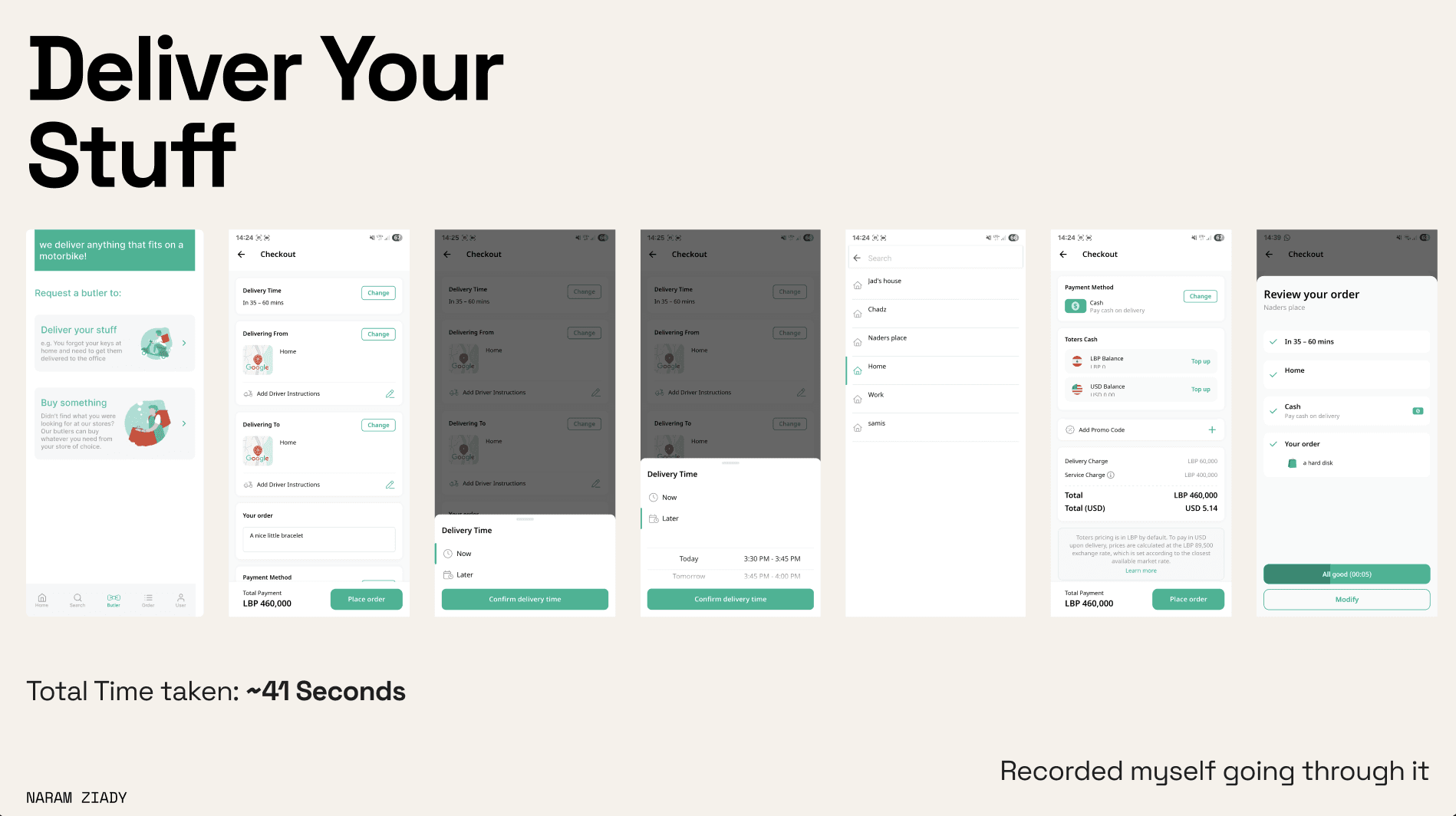
Deliver Your Stuff
~41 seconds
Minimal fields but high cognitive load and poor progress visibility.
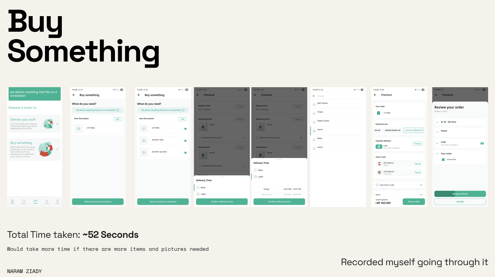
Buy Something
~52 seconds (longer with multiple items)
Requires unnecessary toggles and photo uploads, no saved templates.
what to tackle.
Design Concepts
Problems to Solve:
Hidden fees
Delays in courier pickup
No fallback when demand is high
Poor support access
Key UX Additions:
Real-time courier availability (ex: "5 nearby")
Graceful fallback: suggest a later time if no one picks up
Persistent Help button with embedded chat
Fee breakdown: delivery, platform cut, currency adjustments
result.
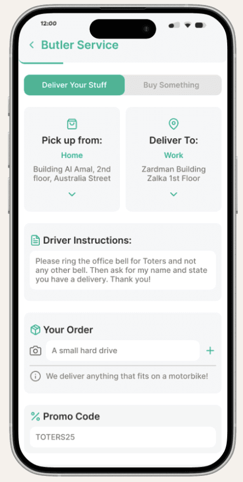
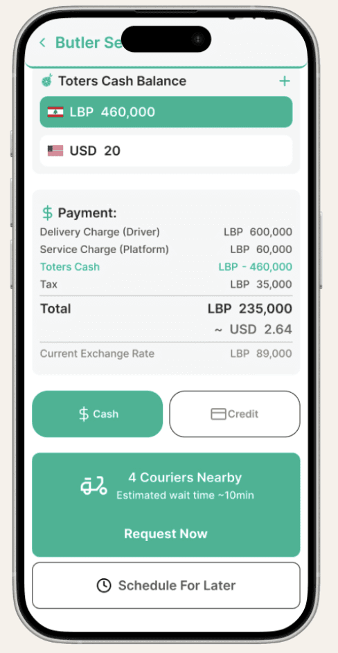
Final Design: All-In-One Flow
Progress Overview: Users now see exactly how many steps are left — no guessing.
Quick Modify: No more backtracking. Add, remove, or adjust anything inline.
Multiple Items & Photos: Supports richer orders with optional photo attachments.
Delivery Instructions: Custom notes now travel with the item, not just the address.
Transparent Costs: Toter Cash appears in green to signal discounts and Users can see total cost in local and USD side-by-side.
Real-Time Pickup ETA: If no couriers nearby, defaults to a reasonable delay — no false promises.
Smart Payments: Tap to switch payment methods.
Schedule later: Now secondary CTA.
Confirm with Confidence: No timer, no stress. A slide-to-confirm gesture reduces accidental taps and improves accessibility for slower readers.
fun exercise.
It was really fun working on this, at first I was really confused as the Butler service for Toters is already simple enough, but the more I dived deep, the more I went back to the basics, I found ways of improving. Thank you for the opportunity to tackle this test!