How I built this site
experiment · this very website
The portfolio is the case study.
01, Start with the wrong question
Every portfolio redesign starts with the same question: what should it look like? I got stuck there for a while, moodboards, references, other designers’ sites, until I realized I was asking the wrong thing. The right question was: what should it be?
I make product design, posters, prints, photos, and illustrations. Any normal portfolio layout forces those into a hierarchy: the case studies get the penthouse, everything else gets a “misc” tab. But there’s one place where all of it already lives side by side as equals, a design file. So the site became one. You arrive inside a designer’s tool. My name sits in a selection box you can grab. The top bar says “editing,” because the file really is open. I’m still in it.

the test I held every decision against: if you land here and know exactly what I do before reading a single word, it worked.
02, Art direction before a line of code
Before Claude ever saw a prompt, the system existed on paper: ink (#141414) on paper (#F2EFE9), one bright Figma blue reserved for chrome, selection boxes and dims tags, never for text, because interface blue meaning interface is the whole bit. One interaction grammar for the entire site: hover lifts up-left and deepens the shadow, press sinks, focus rings in text-blue. Every button, card, ticket, and sticker obeys it, so the site feels like one hand made it.
That wasn’t decoration discipline. It was a survival decision. I knew I’d be generating a lot of UI fast with an AI pair, and speed without a system is how you end up with forty shades of almost-the-same-blue. The tokens were the constitution; everything generated had to comply or get rejected. (The full system is published on this site. There’s an unlinked design-system page for whoever pokes around. Critique freely.)
03, How I actually work with Claude
“Built with AI” is on my about page, so let me show you what that means in practice, because it’s not “make me a portfolio.”
And the final call on every pixel stayed mine. A lot of generated work got rejected, not because it was wrong, but because it wasn’t this site. That judgment is the job.
The AI made me faster; it didn’t make the decisions.
04, What got scrapped, and what it taught me
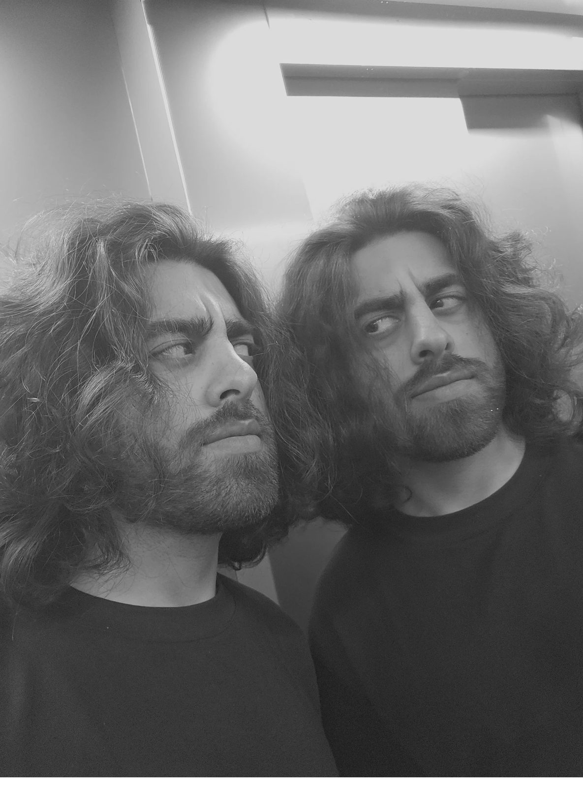
The initial portfolio focused on my hobbies, as I thought highlighting that would give this portfolio a unique touch, but down the line, I realized that looking at the portfolio as it was would probably make you think I was a musical artist rather than a product designer.
The journal alone burned through four concepts before the one you’re seeing. Magazine-style spreads looked good and read dead. A pure typography index made you hover a name just to see the work; for a visual journal, that’s backwards. Then came a FigJam-style board complete with fake collaborator cursors drifting around; it lasted a day, because fake people on a personal site feel exactly as off as they sound. The three-view index survived because it was the only concept where the same entries could be browsed fast, felt slowly, or seen all at once.
The hand-drawn cube that rides the feed’s rail spent an afternoon completely invisible. A fade mask was clipping it to nothing, and I only found it by painting its outline bright red. Once visible, it jumped from thumbnail to thumbnail like a slideshow; it got rebuilt to glide continuously with your scroll, which is the whole reason it feels hand-held now.
And the first entry-opening animation zoomed the whole page out of the card like a box. It broke the moment you clicked anything below the fold, so it got scrapped for something better: the exact cover you click travels into place as the first image of the page, and travels back home when you close it. One idea, both directions, no box.
05, By the numbers
06, What I’d do differently
SEO would be day one, not a rescue mission. The canvas shipped beautiful and invisible: every URL served the same shell, search engines saw nothing, link previews said nothing. Retrofitting the prerender pipeline afterward worked, but building content-first with the canvas as enhancement, instead of canvas-first with content bolted on, would have cost nothing and saved weeks. It’s the same lesson product work keeps teaching: the invisible layer users never compliment is the one that decides whether they arrive at all.
Something that generally surprised me was how much guidance AI needed. I had thought that simply describing in great detail would be enough but most of the time I needed to show the AI exactly what I needed from it, this involved sketches on paper, Figma files, and screen recordings. I would spend a couple of hours fine tuning AI’s output to achieve the results I wanted. If I would do this again, I’d waste less time describing what I wanted and more time showing it.
07, Why this is on a product designer’s site
Because this is the job now. Not “can you use AI,” everyone can. The question is whether you can bring direction, taste, a system, and a verification habit to the collaboration so what comes out is yours, at a speed one person couldn’t reach alone. This site is my proof of practice: designed by me, built with a pair, and every pixel accounted for.
the file’s still open. it always will be.
OBJECT · WEBSITE
- stack
- vanilla js + css. zero frameworks, zero runtime dependencies
- size
- ~5,500 lines, all hand-reviewed
- routing
- history api + dependency-free static prerender
- built with
- claude as a design-engineering pair
- mascot
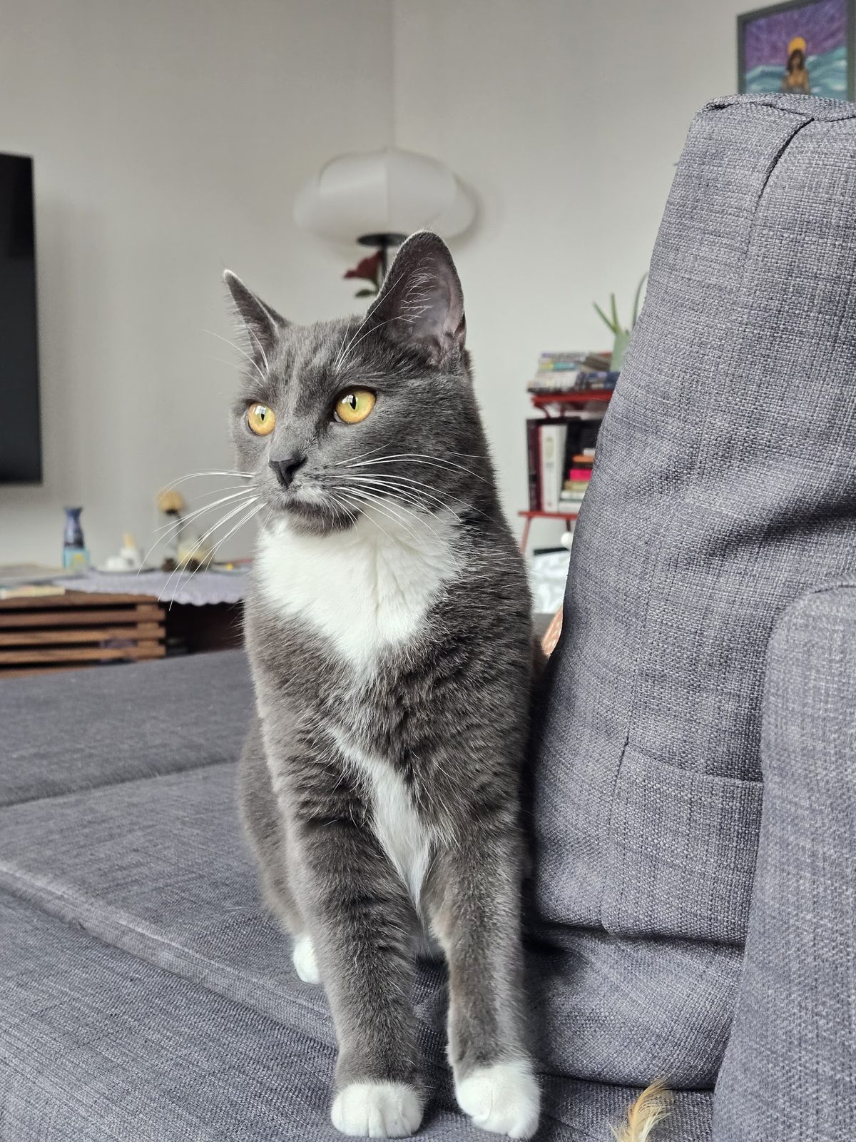
- suki the cat, 13 destinations, 9 tips


COMMENTS (2)
Lazyleaf
“Naram is an awesome designer that has helped us deliver a multitude of projects for our clients (website design, graphics & product design). I enjoy his hands-on approach, the consulting that comes along with his services, and the accountability demonstrated throughout our collaboration.”
Goodwood Tree
“Naram is an excellent web designer, who excelled in delivering a quality product in an efficient and effective manner. He was specific in understanding my goals, and also kind enough to explain some of the finer points of web design. His prices were reasonable for the top-notch work he performs, and I’d 10/10 recommend him for any web design needs you may have!”